Showing posts with label writing. Show all posts

Catch Them If You Can

Lately I've been waking up in the dark of the night with a brain incubating with words. Half-formed rhymes dance tantalizingly overhead and threaten to fly away unless I commit them to immediate memory. For a few intense minutes, I attempt various mnemonic devices (Create an acronym! Build an association chain!) in the hope of staying in my warm bed, but eventually I shuffle off to my office and pit myself in a typing race to catch the winged little creatures before they fade to nothingness.

Here's a poem that came to me recently at 4am and was complete by the time the sun came up three hours later. I may embroider it for an upcoming project I'm thinking of doing on Hollywood - I like the idea of stitching words like "Balenciaga" and "Prius" and "ahi"; they are so redolent of our 21st century narrative.

* * * * *

In Search Of An Ending

She sat in the penthouse bar,
Stylishly wrapped against cold
A capelet adorning her shoulders
A vision for all to behold.
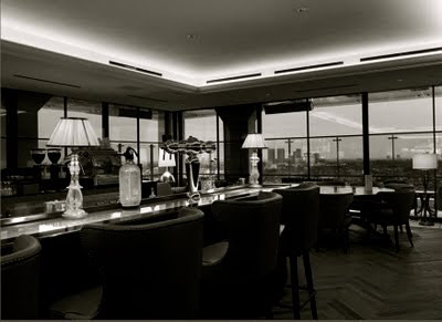
Lace adorning her torso,
(Zac Posen last season, on sale),
Her shoes, Louboutin, half off,
(Via Gilt Groupe's biweekly email).

Neiman's had sold her the handbag,
A Balenciaga, in black,
She felt ill when she thought of the price tag,
And was thinking of taking it back.

The credit card bills were mounting,
The lease on her Prius was due,
The rent on her studio had increased,
Her landlord was threatening to sue.

The bartender reached for her cocktail,
Warm from sitting so long,
She gave him a look, and he left it,
She needed it there to feel strong.

Her Hollywood dreams were still pending,
Auditions had not gone that well,
She had to curtail all the spending
Or it was back home to Tampa to dwell.

The business men wolfed down their ahi,
And knocked back their Grey Goose on ice,
And burped when they thought no one saw them,
And leered at her over their rice.

Her God-given red lips sighing,
She blinked, and surveying the room,
Shook off her creeping exhaustion,
And prayed luck would come to her soon.


(Photo credits: First image, me; second image here; fourth image here; fifth image here; sixth image via marthaadams.com; last image, painting by Christian Schad, 1924)

From The Home Of...

(via here)

Despite the constant presence of email in my life, I still consider hand-written correspondence to be one of life's most important small luxuries. Taking time to write a note, place a stamp on it and send it via the USPS has taken on a strange old-fashioned allure these days, and I am always touched when I receive a well-penned letter in my mailbox -- it feels like a small gift.

A few years ago, I splurged on a supply of Smythson die-stamped personalized correspondence cards and it proved to be one of the most rewarding purchases I've ever made. I chose a pale green-blue color called "Three Crowns" for the paper and had my name engraved in bright red ink. The envelopes were lined in matching red tissue for an extra little surprise upon opening.

Using such precious stationery had the surprising benefit of causing my thoughts to rise to the level of the paper they were written on. Before Smythson (B.S.), I sometimes wrote hastily and without forethought; after Smythson (A.S.), by the time I touched ultra fine point Sharpie to watermarked card, my handwriting was neat and my points were pithy.

So here's what I'm considering now: house stationery.
When we moved to our present home in 2007, we had this slate sign fashioned so our friends and neighbors would know they were always welcome to pop by for a pot (of tea) or a pint (of beer). After all, what's life without a bit of cheeky humor? I'm all for adding a bit of personality to your dwelling. (Live in a top-floor walk-up? Call it "Clouds." Basement studio? Dub it "Down Under.")

Seeking ideas for page layouts, I wondered what kind of house stationery Bloomsbury luminaries such as Virginia Woolf or Lady Ottoline Morrell chose for their personal use and if any examples of it still existed today. Believe it or not, after a brief search, I found them on the Smith College Library website.

I provide them here for inspiration...

1. I like the two-pronged header of Virginia Woolf's Hogarth House stationery...and doesn't it make you wish that telephone numbers still had word prefixes?
(Detail, letter from Virginia Woolf to Katherine Mansfield, 13 February 1921)


2. Here's Lytton Strachey's personal stationery. Love the font...of course, it helps if you get to use words like "Pangbourne" and "Tidmarsh."
(Detail, letter from Lytton Strachey to Virginia Woolf, 9 October 1922)


3. This version of Virginia Woolf's stationery from Monk's House uses an elegant italicised script. I like the "near Lewes, Sussex" part. I suppose I could put "near Hollywood, California" on mine.
(Detail, letter from Virginia Woolf to Robert Spirra, 27 February 1929)


4. This stationery from Lady Ottoline Morrell's country house was available in all the guest rooms and replete with information, including the nearest train station (a chic idea for New Yorkers and other city dwellers).
(Detail, letter from Lytton Strachey to Virginia Woolf, 17 July 1916;
written 0n Lady Ottoline Morrell's house stationery.)


5. I love, love, love the art direction for Lytton Strachey's Hampstead home. That slanted telephone number is so arresting.
(Detail, letter from Lytton Strachey to Virginia Woolf, 17 February 1909)


6. Apparently, Virginia did too. Here's her London townhouse stationery three years later.
(Detail, letter from Virginia Woolf to Lytton Strachey, 6 June 1912)